An automotive manufacturer looking to elevate their brand perception to match a new more premium product.
Mazda was on the verge of a shift in their product design toward more premium design and materials. The previous website was a homegrown solution with no CMS capabilities making it difficult to keep up with content updates and enhancements. The automotive industry is unique in the role a website plays in the modern shopping journey and Mazda needed an experience that put the customer first.
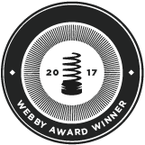
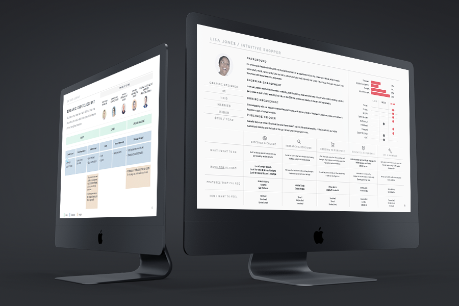
Through our learnings we discovered how shoppers utilized automotive websites throughout their shopping journey and specifically how Mazda shoppers used the site. Mazda has been around for a long time but the average person we surveyed didn't know what was in Mazda's lineup or really what they stood for as a brand. We needed a way to better integrate the brand story into the transactional content that was traditionally on the web.
First off a new CMS was needed. In addition to better improving content management workflows the development of a component library was introduced to speed up creation of new content while still a keeping consistent look and feel. The introduction of a new platform meant a lot of ground work had to be done in order to support design changes that were coming.
In our research we found that shopper's goals were quite different throughout different phases of the journey and that the duration of that journey forced us to look at success metrics outside the normal conversion funnel. Instead we looked at crafting interactions around consumer segments and measured success based on servicing the mindset of the consumer segment at that point in their journey.
Establishing principles and patterns for large distributed teams.
Other than documenting basic principles around usability best-practices we drafted up a list of UX Principles that were specific to Mazda. The problem with "best-practices" is that they are often just common practices. To truly guide the design forward we needed principles that were aspirational in nature and could move the entire organization forward into a new way of approaching digital solutions.
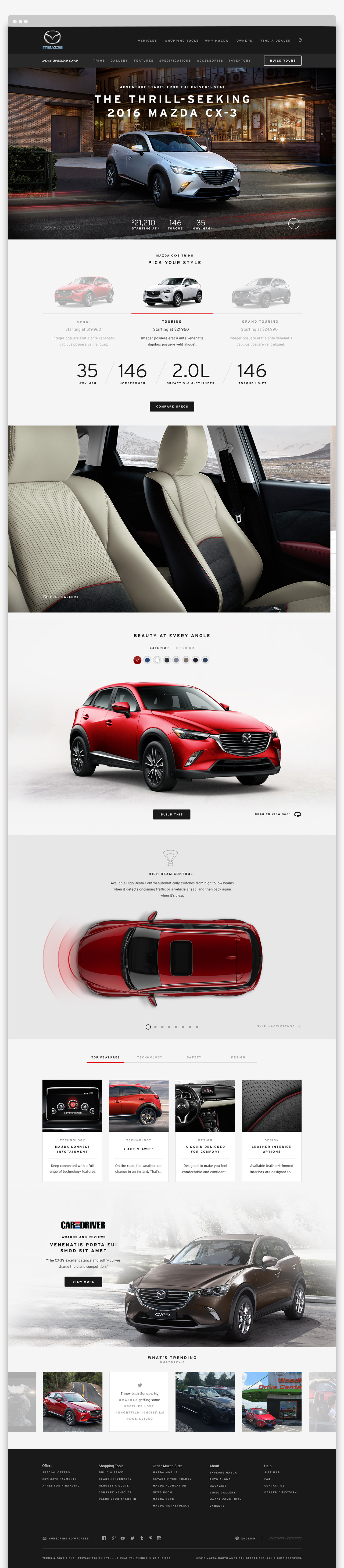
Establishing a visual design language that could be consistent across the web was one of the first things that was tackled by the creative team.
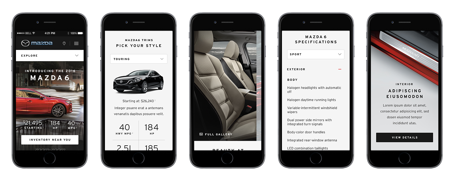
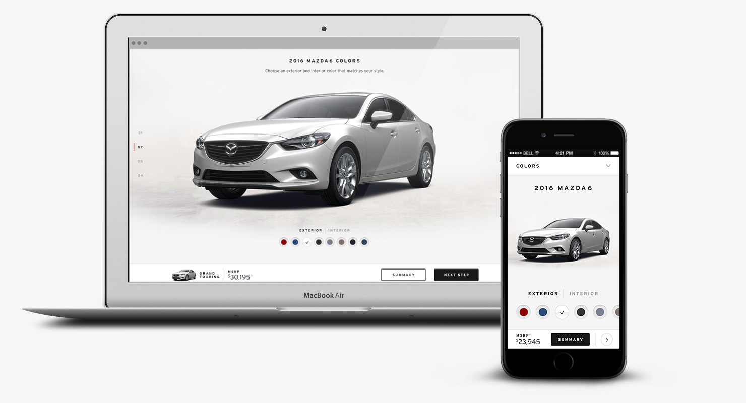
General content pages were easily translated into a responsive framework but more complex tools like the vehicle configurator were more of a challenge. Our research showed that more users were interested in being able to build a vehicle on their mobile and tablet devices than in previous years, so we had to come up with an answer. Initial designs were much more ambitious in terms of animations and additional tool integrations which I hope to see rolled out in additional phases.
Previous vehicle landing pages attempted to include all features of the car on a single page and mixed jump links with external links in the sub-navigation. We cleaned all that up and fleshed out out the Features and Specifications sections to reduce the length of the landing page. The research also showed that users who navigated to the build tool from a VLP were more likely to complete a build. Knowing this we elevated the build CTA and in turn changed the success metric on the VLP from visiting a lead form to visiting the build tool which was more in line with the customer journey map.